Poster Design for the Missouri Bicentennial
A series of posters I designed in submission to the Missouri Bicentennial poster contest.


When I first started sketching, I explored ideas that used the shape of Missouri.
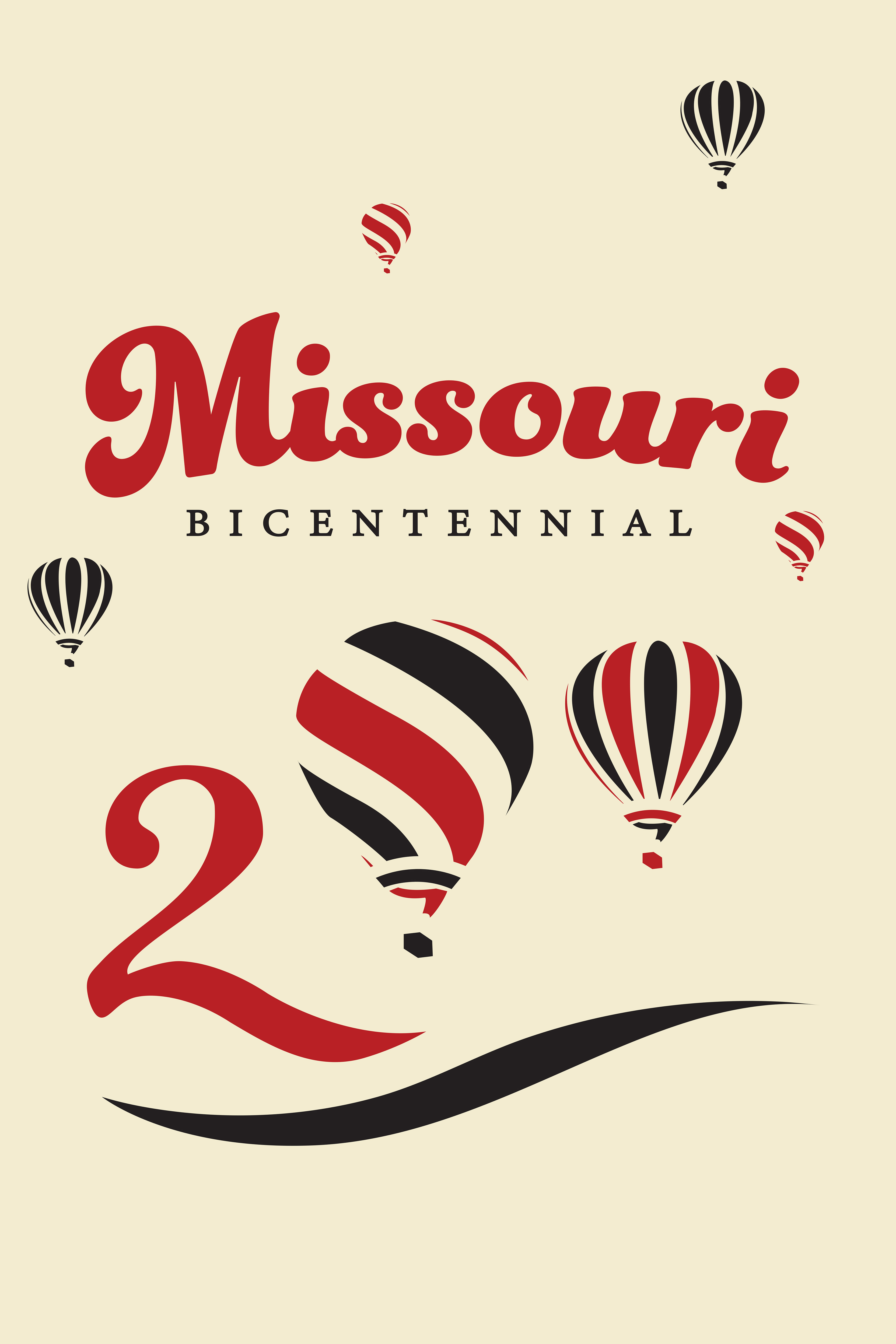
I wanted to go for a more classical, old-timey look, so I used a vibrant red, set against a creamy yellow color.
I wanted to go for a more classical, old-timey look, so I used a vibrant red, set against a creamy yellow color.
I ended up cutting the shape of Missouri and making the logo a simple word mark.
My goal for the logo and posters was to convey both a sense of pride and celebration for the state of Missouri. I landed on the typeface Funkidory. Paired with a bold red, I felt that it gave the word-mark a lively and charming effect.
I originally played with the idea of using the hot air balloons in the logo, in reference to
the annual Great Forest Park Balloon Race. Instead, I decided to expand that idea into
a poster, which sparked my decision that each composition should celebrate
a special part of Missouri.
the annual Great Forest Park Balloon Race. Instead, I decided to expand that idea into
a poster, which sparked my decision that each composition should celebrate
a special part of Missouri.
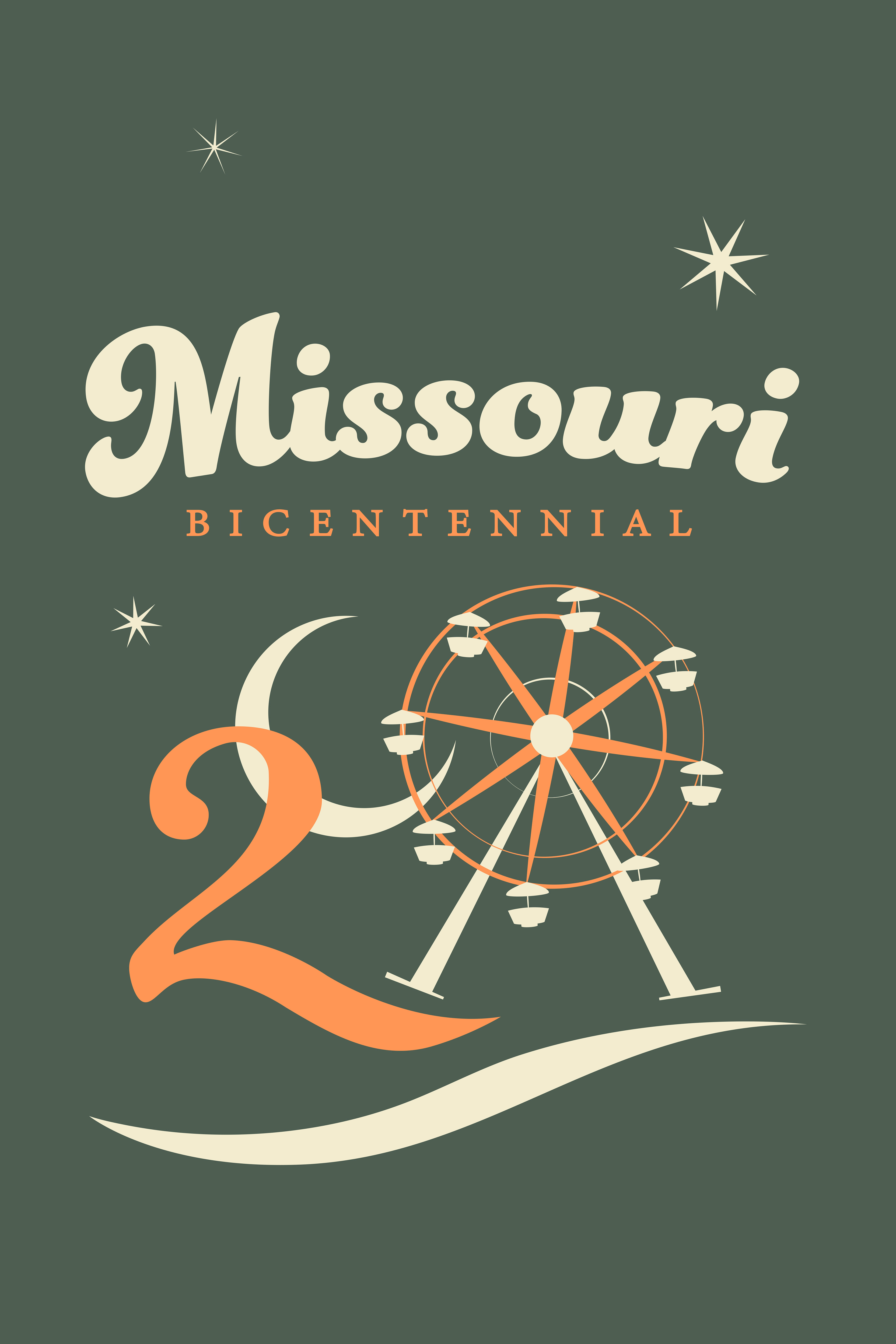
This poster, with the Ferris wheel as it’s focal point, is in reference to the Annual Missouri State Fair in Sedalia that has been happening since 1901. It also made me think about the St. Louis World’s fair, which also had a Ferris wheel, and inspired the design for the next poster.
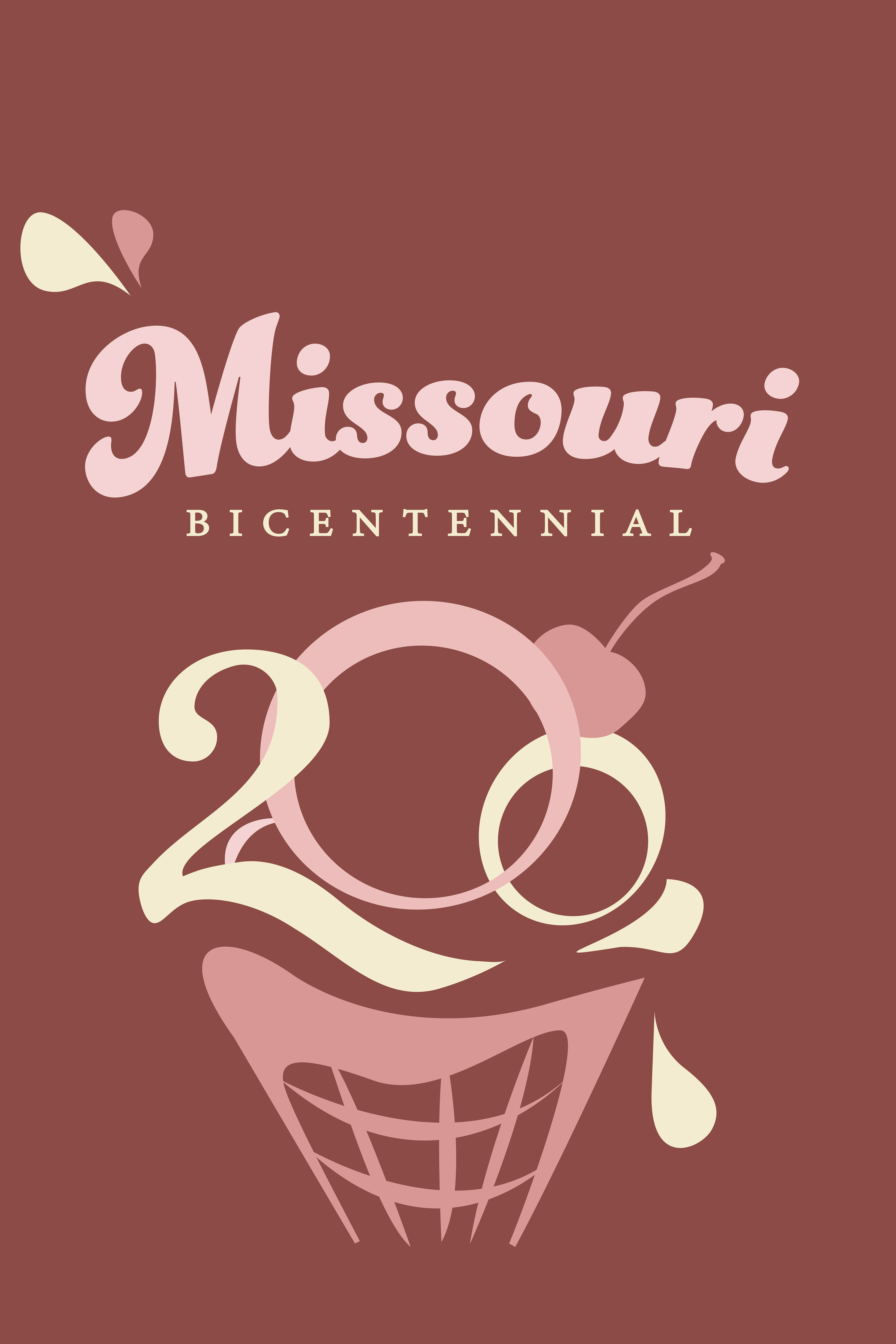
At the St. Louis World’s fair in 1904, the ice cream cone first made its appearance when an ice cream vendor ran out of bowls. A waffle vendor next to him had the idea of rolling the waffles into a cone. Ice cream cones are everywhere now, but they started here, and I thought a 200th birthday would be a good time to reflect on that.